WhatTheFont Redesign
Research · Product · Design
From recognition to discovery.
Modernizing an iconic font-identification tool into a modular experience for discovery across MyFonts and Monotype Fonts.
The problem
An iconic tool responsible for 70% of MyFonts traffic was long overdue for more than a visual refresh. Its brand and experience had not kept pace: the legacy upload-only workflow felt dated, struggled on mobile, and no longer matched modern expectations. Strong traffic was not translating into strong conversion.

Before — WhatTheFont’s historical upload-only experience.
The idea
Turn identification into inspiration

After — a clearer, wider entry point for drag-and-drop, file, and URL-based identification.
The execution

Desktop identification — cleaner selection, more working space, and key actions earlier in the flow.

Mobile-first input — identify type wherever inspiration appears.

Search and results become a discovery surface, not a dead end.
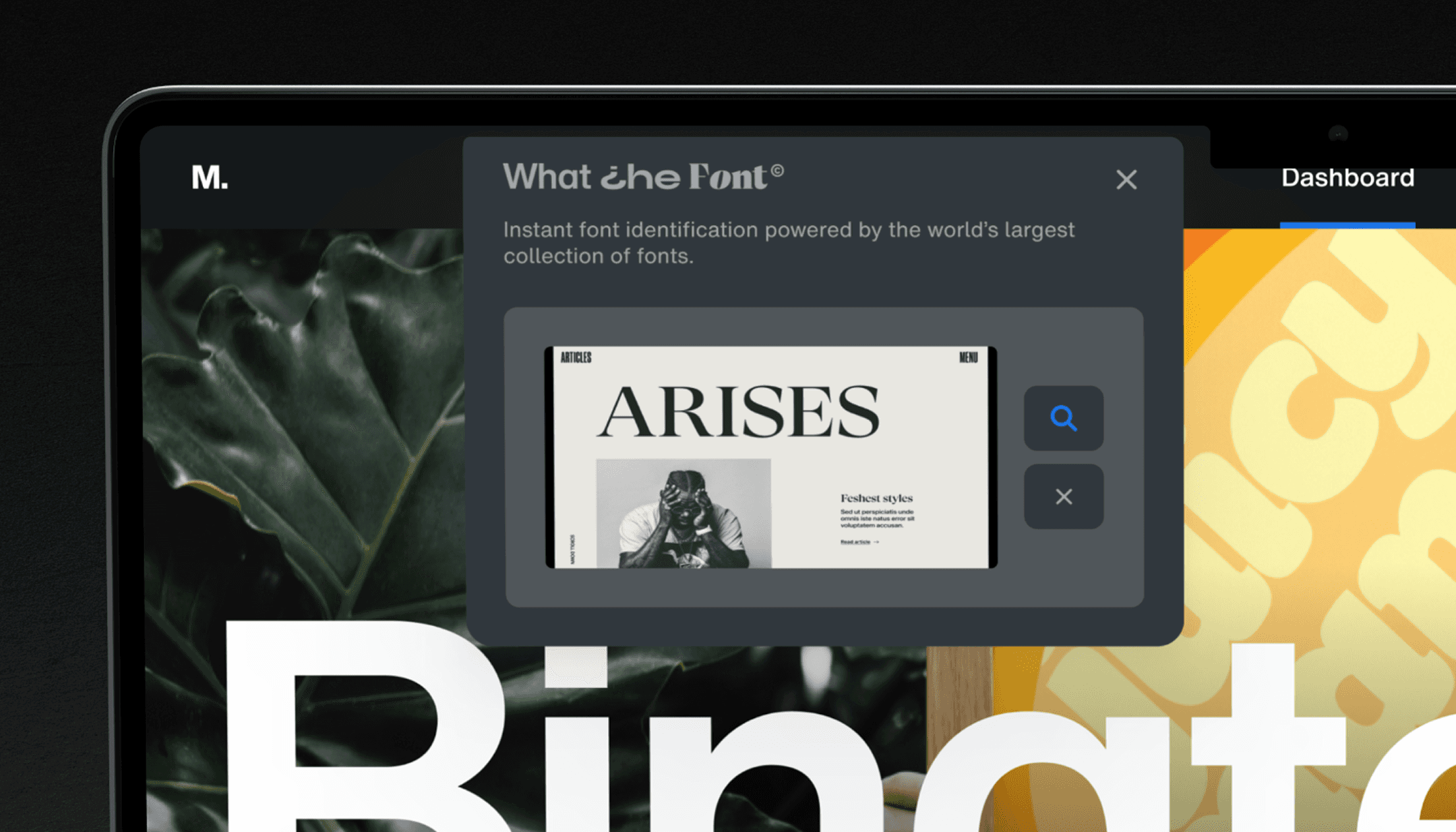
A modular WhatTheFont experience brought into Monotype Fonts.
The impact
A better experience turned attention into action
01 ENGAGE
~27%
pageviews
More people moved deeper into the experience.
02 CONVERT
~13%
ecommerce conversion
Fewer dead ends between identification and purchase.
03 TRANSACT
~24%
transactions
Stronger intent translated into more completed purchases.
04 GROW
~17%
revenue
The redesigned journey produced measurable business growth.
Post-launch product analytics; percentage change versus the previous WhatTheFont experience.
My role