The low-touch, no-touch approach to product strategy
The best software does its job and then gets out of the way. Why I treat interaction as a cost rather than a goal, how that changes what we design, and where AI fits. I gave this as a talk at UX Days 2026, hosted by the Siebel Center for Design; the recording is at the end.
DESIGNED TO BE AVOIDED
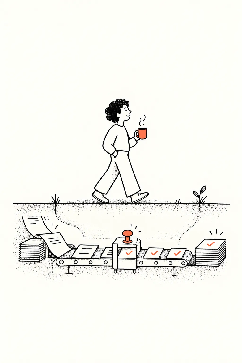
Most software is designed to be used. The best software is designed to be avoided.
The example I reach for first is WinRAR. It did one job, unpacking archives, and did it so reliably that for years it was simply there on most Windows machines. Nobody thought about it beyond the second it took to open a file.
That sounds odd in an industry that celebrates daily active users, time in product and feature adoption as proof that we built something valuable. But a feature can have the right insight behind it, look healthy on every dashboard, and still leave customers unhappy. When that happens, the problem is rarely the design or the feature list. It is that we have stopped asking why the product was hired in the first place.
ENGAGEMENT IS OFTEN THE COST OF VALUE
Engagement metrics are not bad data. They tell you people are showing up and features are being touched. What they cannot tell you is whether the job got done, how much effort it took, or whether the person trusts the system enough to stop checking its work.
What if the metrics we celebrate are working against the outcomes people care about? More time in a product often means more effort, more configuration, more overhead. Someone spending hours in your software may be telling you it takes too long to do its job.
Dashboards can behave like the mother in Rob Fitzpatrick’s The Mom Test: always encouraging, rarely honest about whether the thing is any good.
PRODUCTS ARE HIRED, NOT USED
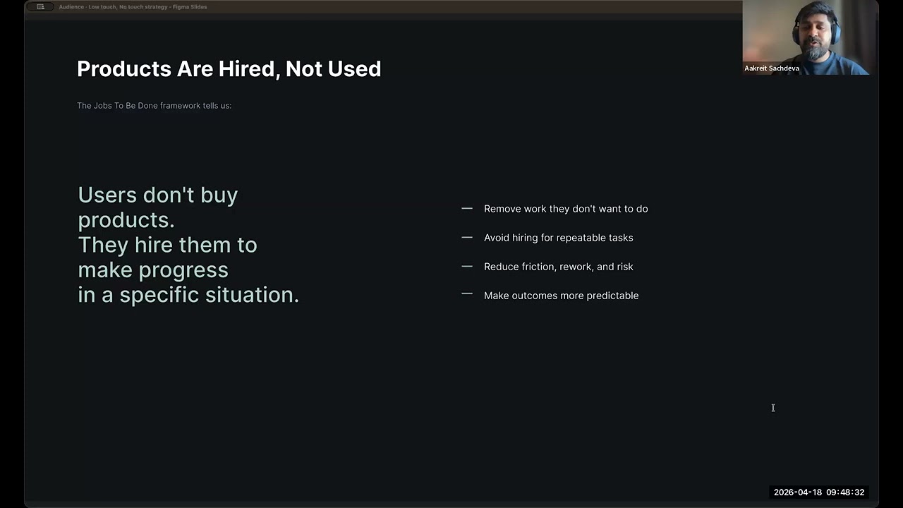
Clay Christensen’s Jobs to Be Done framework puts it cleanly: people do not buy products, they hire them to make progress in a specific situation. In his best-known example, a morning milkshake was competing with a banana for a commuter’s long drive, not with other milkshakes.
A colleague in sales put the software version better than I could: “People don’t hire us to solve their business problems. They hire us to help them do business better.” At Monotype, customers do not want a hundred thousand fonts for their own sake. They want licensing to be clear, discovery to be fast, and the work of managing fonts to stop being their problem.
Organisations adopt software because they want less work: fewer tasks nobody wants to do, less rework and risk, more predictable outcomes. Every one of those jobs is about absence. The less you notice a product doing its job, the better it is doing it.
THE QUESTION IS HOW LITTLE INTERACTION A JOB NEEDS
Every click, configuration step and manual decision spends the time and attention of the person who hired the product. Yet most product strategies still optimise for interaction: more workflows, more dashboards, more settings.
The business side asks the question more bluntly than designers do. Boards and customers want to know why they should spend a couple of hundred per seat. The answer is never that people will spend more time in the product.
So the strategic question stops being how to make a workflow nicer to use. It becomes whether the job can be completed with minimal interaction, or none at all. That is the foundation of a low-touch, no-touch strategy.
I asked the room at UX Days to pick one workflow and count which clicks needed a human decision and which were overhead. One student described Candy Crush: pop-up after pop-up and new storylines between them and the game. “I just want to play,” she said. In a game the success measure should be levels cleared, not clicks absorbed.
COPYING COMPETITORS ERASES THE REASON YOU WERE HIRED
Another student raised the other half of the problem. Apps keep borrowing features from each other until they lose the one thing that made anyone choose them.
I see the result from the buying side. When two tools differ only in minor ways, the conversation becomes a value conversation, and we choose the cheaper one. Agency work taught me to look for the single-minded takeaway, the one thing a product does that nobody else does. Taking a job off someone’s hands entirely can be that differentiator.
LOW-TOUCH MEANS INTENTIONAL, NOT UNDERPOWERED
Low-touch is easily mistaken for simplistic. A low-touch product can still handle complex jobs. What changes is when the user is asked to take part: for setup, for judgment, and for exceptions, the moments where their agency is genuinely needed. Everything else is handled.
Nothing is removed except the steps between the person and the outcome. It is UX optimised for time to value instead of time in product.
Products built this way feel calm. They do not demand attention, and over time they earn trust.
Not every product can, or should, be low-touch. Jira demands configuration and real cognitive load, and very large organisations need that power. That gap is where ClickUp and Linear found room, by simplifying workflows and reducing setup. Even Jira now adds automation and AI to reduce its own toil. The direction of travel is one way.
NO-TOUCH SOFTWARE BEHAVES LIKE INFRASTRUCTURE
No-touch goes one step further. The software does not wait to be instructed. It automates work that never needed a person in the loop, notices patterns and anomalies before they become problems someone has to clean up, and resolves known issues by doing what the user would have asked for.
That is the point where software stops behaving like a tool and starts behaving like infrastructure. Count the products you only think about at the moment they fail, and you have a list of software that is doing its job.
Nobody thinks about electricity until it stops working.
THREE WAYS I DESIGN FOR LESS TOUCH
Three patterns do most of the work.
- Recognise patterns instead of asking for configuration. Up-front settings ask people to predict their own behaviour. A low-touch product watches for repeated actions, time-based routines and consistent decisions, and when it is confident, offers to take over. The product earns the permission.
- Nudge in context instead of interrupting. Google Maps suggests the route home at the end of my day. I never set it up and there was nothing to learn. Some people would rather turn it off; for me it usually appears just as I am thinking about leaving. Most home assistants still ask you to configure routines that a product could notice and offer.
- Collapse known problems into one action. When the system understands a problem and its standard fix, there is no reason to walk someone through seven steps. Give them one confident action. The point is to take effort away, not control.
TRUST IS HANDED OVER IN STEPS
Someone in the audience asked where the line sits between helpful and unsettling. My answer is that users will tell you. We are a generation that bristled at cookie banners and now hands its life story to a chatbot, because the help was worth it. People give up control when a product genuinely solves their problem.
So take two steps forward and one step back. Start with configuration, build confidence, then stop asking. When people push back, retreat and let trust rebuild. Long-standing customers often hand over more control with time, which means building for tenure as well as volume. Teams that hard-code for today’s users spend sprints rebuilding when those users hit a wall.
AI SHOULD MEAN FEWER INTERFACES
AI accelerates all of this, not as a feature but as an enabler of restraint.
We had wanted natural-language search on MyFonts for years: describe your project and get fonts that fit. Every attempt without AI produced poor results, and customers told us the search was not as smart as we thought. They were right. Once we rebuilt it with AI, the response to the results changed noticeably, and it is now live.
Rather than join the “UX is dead” chorus, I treat AI as an ingredient: used where it removes low-value work around a decision, never as a replacement for the decision itself. That is a very different brief from “put a chatbot on it”.
Its real promise is not smarter interfaces. It is fewer of them.
INTRINSIC AI WORKS QUIETLY INSIDE THE WORKFLOW
I find it useful to split AI into two kinds. Intrinsic AI enhances what already exists. It understands files, imagery and unstructured data, and cuts the hours spent reviewing and comparing. The interface does not get bigger; the outcomes get sharper.
Here is one idea from my own industry. Font licences confuse people: what they can publish, where, and when they need more. Imagine a layer that is never explicit but understands enough to say “you’re fine to publish” or “this use falls outside your licence” at the moment it matters, quietly keeping people safe.
EXTRINSIC AI HANDLES WHAT WE CANNOT DESIGN FOR
However robust an interface is, there will always be unique business rules, unusual queries and needs that fit no predefined workflow. We have historically answered them with configuration screens, more filters and more settings. That is how products bloat.
Extrinsic AI takes those edge cases instead. It interprets intent, orchestrates across existing APIs, and assembles a temporary interface from the design system when one is needed.
Filtering shows why. Fashion retailers and Amazon offer a fixed menu of filters. But a designer might want a font with a very particular ampersand or percent sign. Building a permanent interface for every version of that request is not realistic. Letting someone say how they want to filter, and having the system do it, is.
FLUID INTERFACES NEED MORE CRAFT, NOT LESS
I started when web design happened in Photoshop and websites were sliced images reassembled in tables. This is the second shift of that size I have worked through.
I expect products to stay partly standardised, because familiar scaffolding is valuable. Around it, large parts of the experience will adapt to a person’s role, context and intent. Menus, layouts and workflows become fluid, purpose-built rather than arbitrary.
That does not make UI or craft less important; a fluid experience needs more design rigour than a fixed one. Someone still has to decide what clarity looks like when the interface is changing underneath the user. What grows is the scope: adaptability, inference and intelligence become design concerns, not engineering details.
RELIED ON ENOUGH TO DISAPPEAR
A low-touch, no-touch strategy does more than improve usability. It builds trust, reduces operational drag, and makes the case for what the software costs.
The future of software is not about being used more. It is about being relied on enough to disappear.
THE FULL TALK
I gave this talk at UX Days 2026, hosted by the Siebel Center for Design at the University of Illinois, on 18 April 2026. The recording includes the questions from the room. An earlier version of the argument appeared on Muzli.